Tuesday, 10 January 2012

ITAP- Development of ideas & Structure in Moving image.


Moving image is in some respects the epitimy of visual communication. Out of all the typographic advertisements, the illustrative ad campaigns and promotional material, a moving image piece has something other forms of promotion does not, moving narrative. The viewer in a sense does not need to do anything, but lay back and absorb the visual stimulus. So mastering the techniques behind moving image would be a worth wile pursuit for any visual communicator.
 Principle 2 of the lecture identified a plotline used through many different films and how scriptwriters have found the perfect way to convey the narrative of a hero, in the limited time of an average length movie. “ Monomyth”, a perfect example of this would be Luke Skywalker’s journey in Star Wars. There is normally 3 main parts to this Voyage. 
1: Departure- The sub elements being; The call to adventure ( princess Leia’s message), Refusal of the call ( must help with the harvest ), Supernatural aid ( Obi-wan rescues Luke from sand people), Crossing the first threshold ( Escaping Tatooine ),  The belly of the whale ( Trash compactor ). This is the 1st sequence of the film lasting about 40 minutes.
 2: Initiation- The sub elements being; The road of trials ( Light saber practise ), The meeting with the goddess ( Princess Leia ), Temptation away from the true path ( Luke is tempted by the dark side ), Atonement with the father ( Darth and Luke reconcile ), Apotheosis ( becoming god-like )( Luke becomes a Jedi), The ultimate boon ( Death star destroyed ). This is the 2nd sequence of the film, following perfect script writing tradition so far. 
3: Return- The sub elements being;  Refusal of the return ( “Luke, come on!” Luke wants to avenge Obi-Wan), Magic flight ( Millennium falcon ), Rescue from without ( Han saves Luke from Darth ), Crossing return threshold ( Millennium Falcon destroys pursuing TIE fighters), Master of the 2 worlds ( Victory ceremony ), Freedom to live ( Rebellion is victorious over Empire ). This is an awesome piece of storytelling and the reason I used it as an example.
Stereotype
 Principle 3 highlighted character design, something which I find very interesting being an illustrator I often design characters, giving them backstories and history. Within moving image though, there are 4 main character types “ The Protagonist”, which usually is the main character in the storyline, experiences the conflict in the story and does not have to be good. “The Antagonist”, The cause of the problem but does not need to be an actual person. “ Dialogue “, These are the words a character uses within the storyline ultimately having an effect on how the audience perceives him or her.  “ The Stereotype”,  a character that is over simplified and lack any originality or individuality.
Magazine character I designed

ITAP- Production & Outcomes

Interpretation is something which will be different for every single graphic communicator or creative in general. How to take an idea and develop it into something different, something that only you could interperate in a unique way, with your individual skillset and still retains a style reminiscent of your previous work, this is something we all strive for.
  The thing is that we have no choice but to go with the style of our generation. To have a completely untainted style that is devoid of any outside inspirations and completely, utterly unique, you would need to live in a cave 100 miles away from a television, computer or book.  This just isn’t the case, we are constantly inspired by our creative peers and if we were to look back at our generation of artists 200 years from now there will be a unique style, what the name of this artistic period will be we won’t know, will it be as significant as the renascence? No.
James Jean

  The very fact that we are so privileged in accessibility to other artists work at the click of a mouse means that the melting pot has unlimited ingredients. The styles of those artists out there whether they would like it or not are going to be a lot more influenced by others than they would have been 300 years ago. This by no stretch means that this period of time is less important or less unique. This generation of artists is the only generation in history that would have been influenced by the situations unique to our time. Wars, cinema, books and social events that have occurred in the lives of the current generation of artists will never happen again, meaning a specific filtration of aesthetic influence and political statements within artist’s work that is unique. The Zeitgeist of our time.
  With the influence and interpretations out of the way, artists can now work. Which platforms they wish to display they work is the next step. Choosing an appropriate format can be vital, personally I use my blog and Facebook, to make my work widely accessible through my peer group and through other creative channels. Platforms can range from, editorial e.g Magazines, books etc. Publishing ( all forms of printed media incl. Books, brochures, posters etc.) On-line, which in this day and age is perhaps the most useful if done so correctly. Advertising and branding, installations and interventions e.g. galleries, exhibitions etc. Whichever medium or channel artists use the main thing is to keep it appropriate, chasing outlets that don’t have a very accessible end is a waste or valuable time, something that I will keep in mind when working commercially. 


Alex Pardee


ITAP- Legibility & Tone of voice


Legibility and tone of voice are the principles I have chosen to drop my 2 pence on this week. Legibility especially is an incredibly expansive subject and can refer to any which matter of things. In visual communication it generally refers to the legibility of typography primarily, with some other exceptions. Walking down any high street in Britain you will be hit with thousands of logos, advertisements, posters, sales campaigns, information graphics and much more visual stimulus with typography being its focal point. 
 Legibility is what makes some stand out, and some shadow out into the dark chasm of corporate advertising. Now the factors that affect legibility are numerous but can be destructed down to the fundamental elements. Firstly the typeface. The typeface used by a company or independent retailer to promote their establishment can have a number of effects on the potential consumer.
Yellow type fades out.
  If a typeface is sans-serif it usually represents a modern, clean, hygienic, maybe avant-garde establishment very much catering for the more present day consumer. If a serif or script typeface is used, this could mean the shop or service is hoping to entice the more nostalgic old fashioned target market. Colour is also incredibly important in legibility, to stand out against the thousands of logos and adverts you need to have your logo firstly stand out against its own background of you want any chance to be able to be seen against the rest.
  The type should be used on a contrasting colour background e.g., Black type on a white background and vice versa. Our eyes find it difficult to decipher letters too similar in colour to the adjacent pallet for example, yellow type on a white background would be unreadable from afar. Past colour and typeface choice the typographic choices made with the individual logo or promo material can affect the legibility as well. For example if you have a sans-serif typeface of a 5 letter word but artistic licence on the graphic designers side, decided to change the kerning.
Ray Gun
  The word might be aesthetically pleasing on the screen in front of him but the letters might mould into a single unreadable object when seen from afar or in passing. When talking about typographic legibility it is hard not to mention one of the greatest and sometimes detested graphic designers of our time, David Carson. Famed or infamous for his work in the magazine “ Ray gun “ , David Carson pushed typography to the extremes in which people had not seen before, and had a way of laying type over itself to a point when the message was not entirely legible but created artwork on the page whilst doing so. Leading to him coining the infamous phrase “don’t mistake legibility for communication “.

David Carson

 Tone of voice, something you would not necercerally accustom with type, is another very important thing to bear in mind when communicating a message. The typeface used can’t often be the polar opposite of the word that is being described, which is why we need to make conscious decisions when designing anything into the emphasis the letters have on the message. For example, if I were to type the word “shout!” using a bold, sans-serif typeface in capital letters. This would portray the phrase perfectly. “Shout!”, using a whispy serif script font with a in very light acquisition would not be making the most of the typographic potential. 

ITAP- Research & Inspiration

Research and inspiration are some of the fundamental building blocks required in any creative artists arsenal. Whether it be a commercial illustrator or a theatrical set designer, doing your research is key. Not only is it healthy to keep your visual stimulus active by consciously looking at other artists work and what has been done before, but it is also a safety net from you making any mistakes that could have been otherwise averted. We do not have a choice from what we exposed to, we may take inspiration from any wide number of things.  Billboards, advertisements, magazines, television, books, galleries and much more. The skill isn’t in what to look at, that is out of our hands.
  The skill is what we allow to filter through, and this can take years to acquire. Observation is vital, but more so cross communication. One of the most dangerous things we can do as creative is to acquire a brief from a client and stampede into the creative process without first doing any type of research, of the target audience as well as history. 
 The last thing you would want to happen is that you’ve being working on a project for a month and finalising and revised your chosen solution to submit to the client, to find out the idea has been done before. Again something that would of easily been averted if proper research and observation had been carried out. As important as it is, research isn’t the only thing a creative should keep in mind. What does the target audience want? If commissioned to design something specificated to a type of market, get their opinion first. Market research, polls, questionnaires. 
Logo blunder
 This could be the final cog that turns your idea into a consumer attractive money making machine. Something retail giant GAP didn’t take into account when in 2010 they hired a graphic design company to redesign their corporate identity with a flash, new, modern logo. After unveiling the logo was met with a swarm of complaints from customers who did not quite show their gratitude. The thing is people want something they are familiar with, something they can trust. This is the ultimate objective of any corporation or company, which is why something of the most widely successful logos are decades old. If it isn’t broken don’t fix it, GAP quickly reverted back to the logo they had been using for 3 decades due to popular demand. This is just and example of communicating with the target market, but communicating is a skill that should be used as often as possible in the creative world. The greatest asset we can attain is having creative peers, in which we can confide ideas and get fresh perspectives on things. In my magazine project about Birmingham, I put myself forward to take care of the ITAP and had concluded with advice from my team that an interesting idea would be to have and illustrated stop motion of a map on the back of my hand followed by the title of the magazine “ OWAMYA”.
IDENT
  After different attempts and styles, it was a conclusive decision that the idea didn’t have the same affect in affect as it did in theory and I want back to the drawing board. Finally I had an idea which worked a little better and my team agreed. 
The point is that I could of easily just ran with it for the sake of it and not told the members of my team that I wasn’t completely confident in it, but I would of only been cutting myself short and subsequently deterred the learning experience of others, something that is not considered community spirit within the creative world. One of the key principles of the lecture stated that “ the notion of inspiration’ derives from constant inquiry, based on research, observation, recording and experimentation” . Which is entirely true, the recording especially I think is incredibly important, something I try to do at every opportunity as an aid for when I’m at a blank. Then I can take a glance over my notes and re stimulating a thought process which I’d previously forgotten. I tend to do it in my own way also, I’m an illustrator and remember things visually, so naturally in my note taking process I often draw illustrations to aid me when highlighting important points. 

My note-taking journal

Johnny Hardstaff - Inspiration


Jamie Hewlett - Inspiration


Saturday, 31 December 2011

ITAP- Connectivity

Josiah McElheny talking about the notions of originality
One of the key principles of the connectivity lecture was notions of originality in visual communication and further more the art world. Being original and different is something every artist strives for. Doing things and coming up with aesthetic creations in which no one else has done before could well be an
 innocent and valid goal for an artist but the simple fact is that it is quite unattainable. Being creative has been around nearly as long as we have.  We can only hope to recreate and existing idea and add our own style or ideals onto the artwork. After the preraphelite era artists where now abundant with varying degrees of skill but nonetheless a wealthy person could acquire one personally if he so required. The paintings where originally intended for private consumption, therefore artists would make copies of their own works many times without thinking that they would be seen together. This is an example of pieces of art being recreated and re drawn by the artist who created them, often many times, picasso famously recreating la dora maar in about 60 different adaptations. So for contempory artists looking for indivudualistic style, it is a very tall order.


La Dora Maar au chat
I have often found trouble trying to find a style or a particular technique to stick to. But I think the most important thing is not to worry about it, also the fact I am still young, bears evidence that I should try and fail first before resigning to a specific style. See what works for me, many artists died well into their 80's and were still experimenting artistically. It's a case of finding out what methods work for you, paint a way that is comfortable and not be scared to try something different. It is healthy to push yourself at every opportunity. 

Bricolage

Another key principle was Bricolage and its use in contempory culture. Many moons ago the process of Bricolage involved using photography, printed imagery and the more traditional pen, pencil and charcoal. In modern times the process is a little different, often relying on computer software such as Adobe photoshop to adjust and re-touch images to create an intended purpose. A famous example of traditional bricolage would be Elsie Wright-Cottingley's fairies in which a series of 5 photographs were produced in 1917 and used by Arthur Conan Doyle and cause wide hysteria and a nation to question the reality of the mythical creatures known as fairies.

 Contempory artists use slightly different mediums to create bricolage effects, using compiled images of various sources often to advertise a promotional campaign for a perspective client. On the image on left the graphic designer most likely used photoshop to create this effective poster, creating a city line in the ash of the smoking cigarette.

Companies will often hire the assistance of a graphic designer when it comes to advertising, often to portray the corporate identity of the firm or to stir a particular feeling or emotion they wish to evoke in the audience. For example quite often soft drink companies such as coca cola would have a designer photoshop water droplets onto their cans for use in advertising poster, to give the sense of a cool, cold and refreshing drinking experience.


Thursday, 29 December 2011

ITAP- Development of creative thought

Artist Unknown

Creativity and the thought processes which it entails is something that can not always be learnt or furthermore taught. It is now scientifically accepted that the majority of the population have a tendency to use 1 side of their brain more than the other. Those who use their right side of their brain are more creative. Also the right side of the brain being home to philosophy, imagination and spatial perception while those of the left side persuasion often being more logical, analytical and expository. By no means does this mean that if a person tilts more towards the right or left side of thinking that they are completely lacking in some of the traits of their opposing brain side. In my case for example I would confidently say that I am more of a right side of the brain person, being a creative I would at least hope to be. But I also can be extremely analogical and over-rational to the point sometime where I can stunt my own creative process by completely shunting my own artwork because I hate it. So this is to be taken as an excepted rule of thumb but by no means a universal guide for every person on the planet.

Overcoming mindsets.
Overcoming mindsets. The 1st key principle. As visual communicators we can often become entrapped within a certain way of working which sometimes stunts our design process and can very well get in the way of coming up with an innovative idea and something which is interesting and different. Working in this habitual way gets us predictable results. By keeping to the same creative methods which have worked before you do not allow for change, mistakes and imaginative outcomes. Mistakes are needed, by making mistakes you figure out ways around them, often finding completely different ways of communicating the same idea but still keeping it relative and in keeping with your original idea.

Timesaving irony


Getting rid of Assumptions was the 2nd key principle of the lecture. Assumptions within the visual communication industry for me can be transferred and relative in a number of different disciplines. For me I've seen assumption and preconceptions become a big part of the illustration community, with potential clients not acquiring the help and expertise  of an illustrator for a graphic design job because they do not often think that illustrators could also be graphic designers, which a majority of the time is far from the truth. My disciplinary route choice is illustration, but coming from  a 3 year graphic design course, I have had my fair share of logo design, magazine editing and corporate identity.

Problems ?
Restating problems. The 3rd key principle. There will always be problems and creative hurdles to overcome in graphic communication. more so within creative teams when you can add personality clashes into the melting pot. But this is one of the best things about the creative industry, being able you find a creative team with the right amount of cumulative idea and process with a bit of wanting to tear the other person apart and your onto success. You need another opinion, well in commercial visual communication anyway. When a firm has lifted a brief from an influential client and need to design , lets say a product, for mass market, there is no way you can depend on the imagination and view of a single person. Everyone needs to make a contribution.

                                                                         Workspaces
Ward Jenkins

Mel Milton
Developing Ideational fluency. The 4th key principle, is something which I think I'm generally good at. I have now developed my own way of thought generation and fluent design process, where I write down the concept, image or word in which I wish to take further, then surround it in a type of mind-map of thought and ideas often accompanied by scamps and sketches you immediately illustrative my idea. Another part of my
My process
creative process is collecting ephemera to include in my design process. In my magazine project, I have collected various small publications and dissected things I like and dislike about the magazine, and go on to incorporate some of the better design outcomes in my own spreads. I also like to write, alot, I do this more for myself than the person flicking through my sketchbook. I usually like to explain to myself exactly what I'm doing as I'm doing it as I often forget what I was hoping to attempt by the time I start drawing, others I would delineate entirely.


Managing a creative enviroment. The 5th and final principle. This can be incredibly important, the things you surround yourself with while drawing, designing or writing can have an immense influence on your work. Which is why often you will enter the work space of a creative to see it plastered with everything from sketches to limited edition collectible from a sci-fi movie. Also the reason for sticking up sketches and drawings you have done previously is to help you in times of creative block. If your sat there twiddling your thumbs stuck for something to draw, reclining in your seat and looking at a wall with a sketch you have drawn can help you re draw and re imagine something you had previously created.
My workspace.


ITAP- The RVJ

Drawing by hand

Drawing by hand is something that has become 2nd nature to me. I find it incredibly useful and personally the best way to best communicate ideas, at least in the initial developmental stage. The fluidity you get from lead on paper or even ink is something that you can't attain digitally, this means you can change and tinker with your creative thoughts as your thinking them. As seen in this page taken from my sketchbook, my initial creative process is very sporadic and a bit all over the place, with varying thought stems sprouting from a primary word, concept or image usually accompanied by a sketch to help me to instantly visualise what I am trying to describe.

The 1st key principle was to work by hand, the 2nd being to utilise your creative brain which I'm illustrating in this page from my RVJ. Moving on from my initial sporadic thought processes on the 1st page now I have picked a couple of concepts which I find strong and communicate an clear idea and am concentrating on figuring out how they would work. Using sketches and narrative I am helping myself understand how these more deffinative ideas would work in the context of a magazine, allowing trial an error ,with some being strong and interesting but not really tailored in the magazine layout.

Principle 3 and 4 are perfectly illustrated in this page spread from my RVJ for a number of reasons. Firstly by this stage I am starting to develop a visual language in the literal sense and within design context. The concept on these pages is a narrative illustrative idea of having a character cartoon strip within the magazine entitled "how the brummie got it's accent", highlighting the literal interpretation of a visual language. Also as visible in my stlye and way of working I have developed a visual language within a design context, attaining contunuity in the way i communicate my design process aswell as aesthetics, using muted colours in my sketches and scamps. The 4th key principle, Cyclic design process I have shown at the bottom of the sketchbook spread using arrows and graphic novel type illustrations showing the viewer how the story would develop and change, frame to frame. The 5th key process is highlighted in the overall design process, before moving on in my sketchbook i usually evaluate my thoughts and ideas I have concluded in that point in time, usually choosing which one works best and which not to persue.
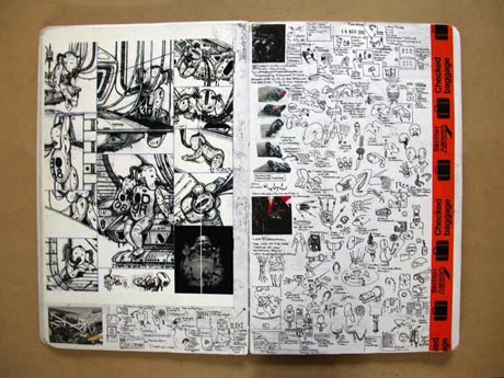
                                     Sketchbook process by an artist I admire Johnny Hardstaff
                     Another collection of sketchbooks from an insperational artist Mattias Adolfson